If we want to build authentic relationships with others, we need to form meaningful connections with them. As humans, we do this by speaking their language.
Whether you’re picking up conversational Italian for your next big adventure or learning the five love languages to improve already existing relationships, I think we can all agree that showing a genuine interest in making the effort changes everything.
So, what does this have to do with your website?
Well, it’s important to remember that website visitors aren’t just page views or conversion rates. They’re humans. They desire connection, and they look toward brands that take the time to really understand what’s important to them. If you’re anything like us and you’re passionate about connecting with your audience, then it’s time to start speaking their language.
Studies show that it only takes 50 milliseconds for website visitors to form lasting impressions of your website. That’s pretty quick, and it says something huge. Are you listening?
First impressions matter, and website visitors across the board place high value on visual design.
So, how do you form meaningful connections with your website visitors? Speak to them visually, of course. Understanding the language of UI design will help you do just that.
Related: Download our eBook on these 7 UX laws to improve your website’s first impressions.
What Is UI Design?
If you work in the digital marketing space, you’ve probably heard the term UI being thrown around left and right. It often gets mixed in with graphic design and its sister, UX. While there’s definitely some crossover among these three disciplines, UI design is an art of its own, and far too many companies overlook its importance.
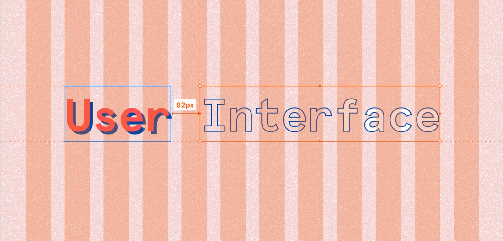
UI, or user interface, design is all about the visual, artistic elements of a product’s presentation that evoke a visceral feeling.
While UX can be described as the framework of a house, UI makes up the décor.
For your website, this includes everything that you can see, such as color palette, typography, copy, icons, graphics, buttons, interactions, and animation. UI designers also ensure that a website looks the way it should across all devices, creating cohesion and evoking the desired response.
Good UI is Emotive UI
UI design is really “human” interface design because we design for humans. Humans are emotional and intellectual beings, and emotions cannot be separated from cognition. In other words, the way we think about something sparks the way we feel, which—harnessed by conscious thought—leads us to act.
The word “emotion” comes from the Latin root “mot,” which translates to “move.” This same root can be found in words like “motor,” “motivation,” and “motion.” Emotive UI designers create experiences that connect with their audience, evoke emotion, and essentially move us.
Don Norman first coined the term “emotional design.” In his book Emotional Design: Why We Love (or Hate) Everyday Things, he writes:
“In the best of circumstances, the visceral reaction to appearance works so well that people take one look and say ‘I want it.’ Then they might ask, ‘What does it do?’ And last, ‘And how much does it cost?’ This is the reaction the visceral designer strives for…”
So, how do you evoke a visceral response? The answer is to enhance your UI design. To get started, check out these four major areas where you can improve your UI design.
4 Major Areas To Improve Your UI Design
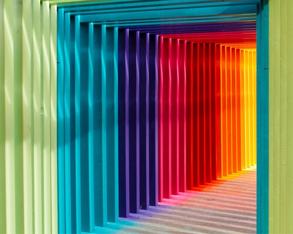
Example #1: Color
There’s so much that can be said about color. For starters, up to 90% of first impressions of products can be based on color alone. While colors definitely evoke emotion, here in the digital marketing space, it’s actually a common misconception that choosing the “right” color evokes “specific” emotions. In truth, color affects each person differently based on personal past experiences.
To avoid relying on color stereotypes, consider the context. Ask yourself, what is the product? Who is the audience? Then, choose colors based on the personality you intend to portray. For example, if you want people to fall in love with your rugged, outdoorsy camping gear company, you wouldn’t choose Ballet Pink.
It’s much more important to link color to product and personality as opposed to aiming for “specific” emotions. If you are true to your brand and product, your design will naturally meet people’s needs evoking the desired response.
To avoid any problems, Matthew Edwards, Art Director here at Electric Kite, suggests to design in black and white before adding any color. This allows you to focus on layout and spacing without the influence of color. When adding colors, a surefire way to add visual interest is by following analogous, monochromatic, or triadic color schemes. However, there are many ways to create dynamic and effective color schemes without following traditional color theory.
You’ll also want to be mindful of contrast. Soft contrast typically works well as long as it doesn’t hinder readability, while high contrast amplifies certain elements. For example, CTAs especially benefit from high contrast as they’re much more helpful to viewers when they stand out. We love Picular, which is just like Google but for colors!

Example #2: The Golden Ratio
From the spiral of the nautilus shell and the center of a sunflower to the magnificence of the Milky Way galaxy and the beauty of the human face, the “golden ratio” echoes throughout all of time and creation, enrapturing artists and influencing art—including the Renaissance wonders of Michelangelo and Leonardo Da Vinci.
The golden ratio, or the “divine proportion,” creates a grid system, and research shows that our brains are actually designed to prefer visuals that abide by it. If you’re looking for the golden ticket to evoking a visceral reaction, this is it.
So, how does it work? The golden ratio calculates to 1:1.618, but don’t let the math make you nervous. It’s all about guiding your website visitors to the information they’re looking for through a pleasing visual hierarchy.
To do this, set the dimensions of your website to 1:1.618, and follow the golden spiral for your content layout, placing details at or nearest to the spiral’s center. Identify the best sizes for subheadings by dividing the main headings by 1.618.
Content needs to breathe. If there’s not enough white space, your design will feel cluttered and confusing. Determine the best amount of white space for your layout by measuring with golden proportions.
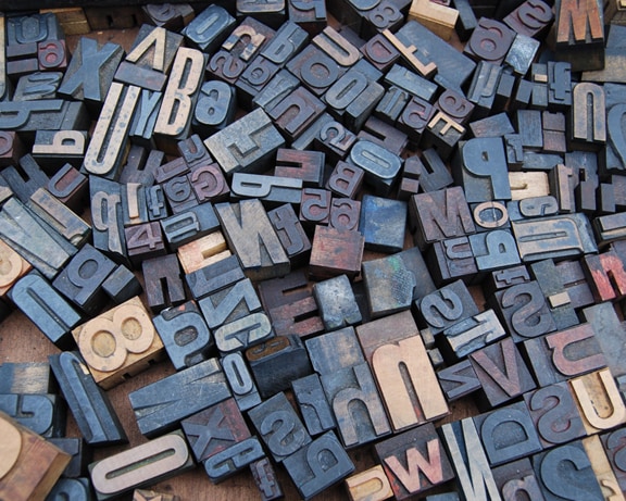
Example #3: Typography
In his book, The Elements of Typographic Style, Robert Bringhurst writes, “Typography is the craft of endowing human language with a durable visual form.”
While content is king, the way you present your content has major implications on how it will be received. Think of your content as a gift. The way you wrap it matters.
Each font has its own personality. For example, serif fonts communicate a timeless, classical look while sans serif fonts communicate a sleek, modern look. If fonts appear out of touch with the context, website viewers may not be interested in engaging with your content. Choose fonts that are clear but also present the personality you intend to portray.
Example #4: Copy
The way you say what you are saying matters. Clever copy captivates the mind by magnifying the message. However, you need to know what you are trying to say before you can say it cleverly. After all, Michelangelo didn’t chisel out the finer details of David’s physique before establishing the basic structure of the sculpture.
Sometimes the hardest thing to do can be communicating your ideas in plain English. I often find that speaking ideas aloud works wonders. Once you’ve decided on what you’re trying to say, play with the words.
To do this, start a brainstorm journal. Jot down all of your main ideas. Then, flesh them out. For each main idea you would like to convey, write down all of the words, images, and associations that you can possibly dream up, and don’t worry about sounding silly or abstract. Silly thoughts are often the most brilliant thoughts. After all, how do you think Evernote got its elephant logo? Or MailChimp got its name?
Next, turn your word clouds into rhetorical devices. If you look at some of the most well-known brands like Apple, Nike, and The Coca-Cola Company, they all use rhetorical devices proving their effectiveness. Three to get you started are tricolons, alliteration, and antithesis.
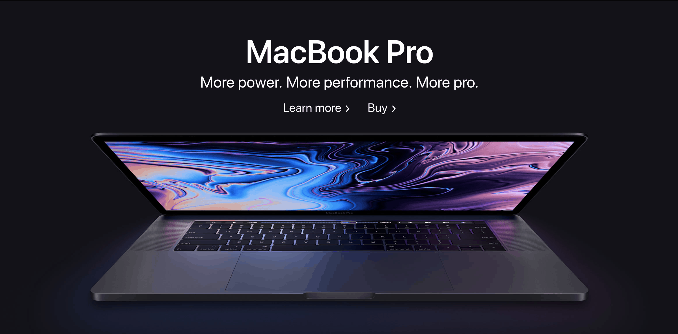
- Tricolons Apple prides itself on tricolons, which are comprised of three parallel words or sentences. For example, Apple has used tricolons such as, “Wireless. Effortless. Magical.” and “More power. More performance. More pro.” Tricolons impact the reader through brevity and surprise. (Note: This second example also includes “anaphora” as it uses the same word at the beginning of each phrase.)
- Alliteration Power pack your copy with alliteration. How does it work? Repeat the same sound at the beginning of successive words for a sweet, sonic effect. For example, Asana’s slogan reads, “Spend less time on guesswork. And do more great work.” People Per Hour uses, “Hire in minutes, pay per hour,” and Upwork’s headings include “Writing wizards” and “Web dev ninjas.”
- Antithesis Lastly, deliver the information your readers need in a concise yet delightful way by using antithesis. Antithesis is when you put two opposing ideas beside each other. For example, Lasalle College High School uses the antitheses, “Come to learn. Leave to serve.” And, “Boys will be boys, but LaSalle boys will be gentleman.” These antitheses work to convey the mission of the school in a memorable way.
The Takeaway: Website visitors desire connection, and we need to create and foster this connection through emotive UI design.
For more tips to improve your website’s overall visual design, check out this next post about UX design.