Business owners and online marketers are focused on one thing more than almost any other when it comes to website design: user experience. It’s this nebulous quality that determines whether prospects will stick around on your website or click away in frustration.
You have two choices for creating a great website user experience: adaptive and responsive web design. But which is best for your business?
First, the Similarities
There are several similarities between responsive and adaptive web design. They both result in websites that render beautifully on all different types of devices. Whether your visitor is viewing your site on a tiny smartphone or a three-monitor desktop display, all the elements will remain properly scaled and well-positioned.
Additionally, they’re both looked upon fondly by Google because they improve the user experience and make consuming content easier. Search engines give preference to websites that use adaptive or responsive design because they result in more satisfied viewers.
Responsive Design Is Easier to Implement
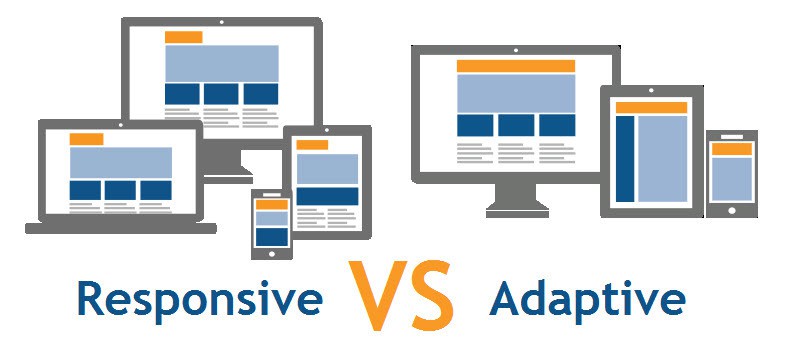
With responsive design, you create one version of your website that adjusts itself based on the user’s screen size. For smaller devices, the text gets a little smaller, images shrink, and navigation bars are consolidated. The design relies on the same code, however, which makes it easy to create.
Adaptive design is different. You’ll create different versions of your website based on screen size. When a user visits your site, the server will determine the type of device and serve up the correct version of the site. Consequently, it takes more time, energy, and money to create and launch.
Adaptive Design Creates More Options
While responsive website design is highly configurable, it also creates a few limitations. Your CSS and HTML must align just so if you want your content to render correctly across all devices. A single error or misstep in the sizing of an image or the padding between elements can throw off the design on smaller devices.
Adaptive design handles this better. Since you’re creating separate versions, you can optimize each one for the specific device. As long as you test your work, you’ll ensure a fantastic user experience because the design is made to fit the device.
Which Should You Choose?
The best design choice for your business depends on the ways in which your customers view your content. For instance, do most of them use smaller devices? If so, you might want to consider adaptive website design because you’ll be able to serve up a website that appeals to your viewers’ habits.
Alternatively, you might prefer a responsive web design if your target audience views your website on their larger devices. Since responsive sites often load quicker than their adaptive counterparts, you might prefer this option if your viewers prize fast loading speeds so they can get the information they want as quickly as possible.
Ultimately, it is up to you to decide whether responsive or adaptive or responsive design is best for your business. While it might be tempting to stick to a responsive design for the sake of expedience, it’s crucial to check the pros and cons of both designs in full. Whichever you decide, consider incorporating it into the prototyping stage of the design process in order to test it out before making the final product.